
Components & interactionsAnimated icon morph
Icons between states
A menu, a playback symbol and an add action keep their identity while changing shape.
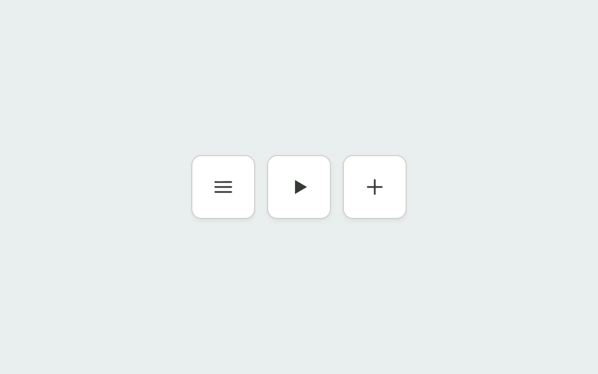
Toggle each icon
Add to your project
Component source
Standalone React component. Styles are included.
npm install [email protected]Render the default export inside a container with a defined height. Its optional active prop stops movement when false. This example works with React 19; Next.js projects can use it as a client component.
View source code
/**
 * Adapted from https://github.com/ddoemonn/interior/blob/314800833bf01e23e6ae74c2a17fbdaac3688c84/components/interior/icon-morph.tsx
 * Retains the preset SVG paths, collapsed-path normalization and spring interpolation.
 * Standalone styles and original demo content; reduced-motion and preview controls.
 *
 * MIT License
 *
 * Copyright (c) 2026 ozzy
 *
 * Permission is hereby granted, free of charge, to any person obtaining a copy
 * of this software and associated documentation files (the "Software"), to deal
 * in the Software without restriction, including without limitation the rights
 * to use, copy, modify, merge, publish, distribute, sublicense, and/or sell
 * copies of the Software, and to permit persons to whom the Software is
 * furnished to do so, subject to the following conditions:
 *
 * The above copyright notice and this permission notice shall be included in all
 * copies or substantial portions of the Software.
 *
 * THE SOFTWARE IS PROVIDED "AS IS", WITHOUT WARRANTY OF ANY KIND, EXPRESS OR
 * IMPLIED, INCLUDING BUT NOT LIMITED TO THE WARRANTIES OF MERCHANTABILITY,
 * FITNESS FOR A PARTICULAR PURPOSE AND NONINFRINGEMENT. IN NO EVENT SHALL THE
 * AUTHORS OR COPYRIGHT HOLDERS BE LIABLE FOR ANY CLAIM, DAMAGES OR OTHER
 * LIABILITY, WHETHER IN AN ACTION OF CONTRACT, TORT OR OTHERWISE, ARISING FROM,
 * OUT OF OR IN CONNECTION WITH THE SOFTWARE OR THE USE OR OTHER DEALINGS IN THE
 * SOFTWARE.
 */

"use client"

import { motion } from "motion/react"
import { useCallback, useEffect, useMemo, useState } from "react"

// Subscribe directly so a changed system preference also stops an active preview.
function useReducedMotion() {
  const [reduced, setReduced] = useState(true)
  useEffect(() => {
    const preference = window.matchMedia("(prefers-reduced-motion: reduce)")
    const update = () => setReduced(preference.matches)
    update()
    preference.addEventListener("change", update)
    return () => preference.removeEventListener("change", update)
  }, [])
  return reduced
}

const CELL = { type: "spring", stiffness: 520, damping: 34, mass: 0.45 } as const
const CROSSFADE = { type: "spring", stiffness: 260, damping: 34, mass: 0.8 } as const
const INSTANT = { duration: 0 } as const

const NUMBER = /-?\d*\.?\d+/g
const CENTER = "12"

export type MorphShape = {
  d: readonly string[]
  rotate?: number
}

export type IconMorphMode = "stroke" | "fill"

export type IconMorphPreset = "menu-close" | "play-pause" | "plus-minus" | "check-close"

export type IconMorphSlot = {
  key: number
  d: string
  visible: boolean
}

export type IconMorphSemantics = "label" | "pressed" | "expanded"

export const iconMorphPresets: Record<
  IconMorphPreset,
  { mode: IconMorphMode; labels: readonly string[]; shapes: readonly MorphShape[] }
> = {
  "menu-close": {
    mode: "stroke",
    labels: ["Menu", "Close"],
    shapes: [
      {
        rotate: 0,
        d: ["M 4 7 L 20 7", "M 4 12 L 20 12", "M 4 17 L 20 17"],
      },
      {
        rotate: 90,
        d: ["M 6.5 6.5 L 17.5 17.5", "M 12 12 L 12 12", "M 6.5 17.5 L 17.5 6.5"],
      },
    ],
  },
  "play-pause": {
    mode: "fill",
    labels: ["Play", "Pause"],
    shapes: [
      {
        d: ["M 8 5 L 14 8.5 L 14 15.5 L 8 19 Z", "M 14 8.5 L 20 12 L 20 12 L 14 15.5 Z"],
      },
      {
        d: ["M 8 5 L 11.5 5 L 11.5 19 L 8 19 Z", "M 15 5 L 18.5 5 L 18.5 19 L 15 19 Z"],
      },
    ],
  },
  "plus-minus": {
    mode: "stroke",
    labels: ["Add", "Remove"],
    shapes: [
      { rotate: 0, d: ["M 5 12 L 19 12", "M 12 5 L 12 19"] },
      { rotate: 180, d: ["M 5 12 L 19 12", "M 5 12 L 19 12"] },
    ],
  },
  "check-close": {
    mode: "stroke",
    labels: ["Confirm", "Cancel"],
    shapes: [
      { d: ["M 5 12.5 L 10 17.5 L 19.5 7", "M 12 12 L 12 12 L 12 12"] },
      { d: ["M 6.5 6.5 L 12 12 L 17.5 17.5", "M 17.5 6.5 L 12 12 L 6.5 17.5"] },
    ],
  },
}

function isCollapsed(d: string): boolean {
  const nums = d.match(NUMBER)
  if (!nums || nums.length < 4) return false
  return nums.every((n, i) => n === nums[i % 2])
}

function normalize(shapes: readonly MorphShape[]): IconMorphSlot[][] {
  const slots = shapes.reduce((most, s) => Math.max(most, s.d.length), 0)

  return shapes.map((shape) =>
    Array.from({ length: slots }, (_, i) => {
      const own = shape.d[i]
      const sibling = shapes.find((s) => s.d[i] !== undefined)?.d[i] ?? ""
      const d = own ?? sibling.replace(NUMBER, CENTER)
      return { key: i, d, visible: !isCollapsed(d) }
    }),
  )
}

function toIndex(value: number | boolean): number {
  return typeof value === "boolean" ? (value ? 1 : 0) : Math.trunc(value)
}

export type UseIconMorphOptions = {
  preset?: IconMorphPreset
  shapes?: readonly MorphShape[]
  mode?: IconMorphMode
  labels?: readonly string[]
  active?: number | boolean
  defaultActive?: number | boolean
  onActiveChange?: (index: number) => void
}

export function useIconMorph({
  preset = "menu-close",
  shapes,
  mode,
  labels,
  active,
  defaultActive = 0,
  onActiveChange,
}: UseIconMorphOptions = {}) {
  const base = iconMorphPresets[preset]
  const source = shapes ?? base.shapes
  const names = labels ?? base.labels
  const count = source.length

  const [internal, setInternal] = useState(() => toIndex(defaultActive))
  const reduced = useReducedMotion()

  const raw = active === undefined ? internal : toIndex(active)
  const index = count === 0 ? 0 : Math.min(Math.max(raw, 0), count - 1)

  const frames = useMemo(() => normalize(source), [source])

  const setIndex = useCallback(
    (next: number) => {
      if (count === 0) return
      const wrapped = ((next % count) + count) % count
      if (active === undefined) setInternal(wrapped)
      onActiveChange?.(wrapped)
    },
    [active, count, onActiveChange],
  )

  const toggle = useCallback(() => setIndex(index + 1), [setIndex, index])

  return {
    index,
    count,
    slots: frames[index] ?? [],
    rotate: source[index]?.rotate ?? 0,
    mode: mode ?? base.mode,
    label: names[index] ?? "",
    labels: names,
    transition: reduced ? INSTANT : CELL,
    labelTransition: reduced ? INSTANT : CROSSFADE,
    setIndex,
    toggle,
  }
}

const stage: React.CSSProperties = {
  width: "100%",
  height: "100%",
  minHeight: 260,
  display: "grid",
  placeItems: "center",
  padding: 24,
  boxSizing: "border-box",
  background: "#eeede8",
  color: "#343832",
  fontFamily: "inherit",
}
const button: React.CSSProperties = {
  position: "relative",
  display: "inline-flex",
  alignItems: "center",
  justifyContent: "center",
  gap: 10,
  minHeight: 46,
  padding: "0 20px",
  border: "1px solid #cfcec7",
  borderRadius: 10,
  background: "#fff",
  color: "inherit",
  font: "inherit",
  fontSize: 13,
  fontWeight: 500,
  cursor: "pointer",
  outlineOffset: 4,
  touchAction: "manipulation",
  boxShadow: "0 2px 3px #252a2010",
}
const hidden: React.CSSProperties = {
  position: "absolute",
  width: 1,
  height: 1,
  padding: 0,
  margin: -1,
  overflow: "hidden",
  clipPath: "inset(50%)",
  whiteSpace: "nowrap",
  border: 0,
}

function MorphControl({ preset, active }: { preset: IconMorphPreset; active: boolean }) {
  const reduced = useReducedMotion() !== false || !active
  const { index, slots, rotate, mode, label, toggle } = useIconMorph({ preset })
  return (
    <button
      type="button"
      aria-label={`Toggle ${preset.replaceAll("-", " ")}`}
      aria-pressed={index === 1}
      onClick={toggle}
      style={{ ...button, width: 64, height: 64, padding: 0 }}
    >
      <motion.span
        aria-hidden
        initial={false}
        animate={{ rotate: reduced ? 0 : rotate }}
        transition={reduced ? INSTANT : CELL}
        style={{ display: "grid", placeItems: "center" }}
      >
        <svg
          viewBox="0 0 24 24"
          width="24"
          height="24"
          fill={mode === "fill" ? "currentColor" : "none"}
          stroke={mode === "stroke" ? "currentColor" : "none"}
          strokeWidth="1.75"
          strokeLinecap="round"
          strokeLinejoin="round"
        >
          {slots.map((slot) => (
            <motion.path
              key={slot.key}
              initial={false}
              animate={{ d: slot.d, opacity: slot.visible ? 1 : 0 }}
              transition={reduced ? INSTANT : CELL}
            />
          ))}
        </svg>
      </motion.span>
      <span style={hidden}>{label}</span>
    </button>
  )
}

export default function IconMorphExample({ active = true }: { active?: boolean }) {
  return (
    <div style={{ ...stage, background: "#e9edef" }}>
      <div style={{ textAlign: "center" }}>
        <div style={{ display: "flex", flexWrap: "wrap", justifyContent: "center", gap: 12 }}>
          {(["menu-close", "play-pause", "plus-minus"] as const).map((preset) => (
            <MorphControl key={preset} preset={preset} active={active} />
          ))}
        </div>
      </div>
    </div>
  )
}
Where it works well
Connect the two states of an occasional icon action with continuous SVG geometry.
Reduced motion
Paths update immediately and rotation is removed.
Things to know
These controls demonstrate local states. Connect their state to a real menu, player or item action in your application.